I recently had a chance to do some logo design work; something I haven’t done in a while.
Ann Cameron Pearce
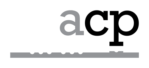
Mom and I recently launched a new website (which I’ll talk about next) to sell flute music from her and other artist. She wanted a logo to help brand her work.
Playing with her initials and several fonts, I noticed that the Rockwell font made her lowercase initials look a little like a face. The “a” was an ear, the “c” was an eye, and the “p” was a nose and eye. I know, I have a vivid imagination.
My idea was to place a flute underneath her initials, which would make it look like initials were playing the flute. After bouncing several ideas around with my cousin and graphic artist Chad Cameron, we came up with this.
ScoreVivo
The new company and website we created is called ScoreVivo. It’s a new sheet music publishing company that currently sells downloadable compositions and arrangements by Ann Cameron Pearce, Al Hager, and Trevor Wye.
For this logo, I wanted to illustrate that the site is about music. Using the Lassus font, I established a basic score. I then placed the text ScoreVivo on top of the score. The design change that ties the two together occurred when I replaced the dot in the “i” with a whole note. My only concern is that it’s too subtle for most people to notice. I just hope musicians might be more attuned (pun intended).

